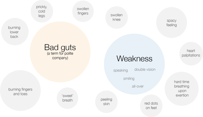
I was just working on a basic diagram of my symptoms for an ignite talk I’m giving in a few weeks at the eyeo festival, a data visualization conference held in Minneapolis. I wanted the diagram to communicate how I felt when I was going to see a new doctor for the first time: overwhelmed by the ‘constellation’ of various symptoms, confused, and unsure where to begin. I wanted all of the symptoms to feel kind of random and disassociated, but with ‘Bad guts’ and ‘Weakness’ jumping out as the most significant. Here’s the diagram that I had come up with:
Because I can’t help myself from trying to create some kind of order out of chaos, I started to try to associate the grey satellite symptoms to either the ‘Bad guts’ or the ‘Weakness’ mother ships. I realized quickly that nearly all of them landed on ‘Bad guts.’ Then, I coded in whether the symptoms were made worse by humidity (water drop icon) or by sugar/carbs (weird candy icon.) Here’s the organized, more meaningful diagram:
Hey, now we’re getting somewhere! I am not sure what the causal relationship is for many of these symptoms, but I do know that there is an association between them. For instance, when I am in a period of excellent guts, I do not experience sweet breath, red dots on my feet, heart palpitations, burning lower back, or peeling skin. I like this new way of looking at my symptoms, and I think I’ll bring it to my next ‘new doctor’ appointment – though this time, it’s with an herbalist. Should be interesting.

